
Styleguide
Design foundations for the theme — colours, typography, spacing, buttons, forms and the grid.
Colours
Brand Colours
The palette. Everything else on this page is built from these, so changing one here recolours the site.
Brand
-
$color-brand-primary#9602b5 -
$color-brand-primary-dark#4b015b -
$color-brand-secondary#1e165b -
$color-brand-tertiary#f4def9 -
$color-brand-quaternary#cb5de2
Neutrals
-
$color-black#000000 -
$color-grey-xdark#3a3a3a -
$color-grey-dark#6e6e6e -
$color-grey#8a8a8a -
$color-grey-light#d4d4d4 -
$color-grey-xlight#f2f2f2 -
$color-white#ffffff
Feedback
-
$color-validation-error#c00000 -
$color-validation-success#008000
Page
The default text, background and line colours. A module on a coloured background (see Backgrounds) swaps these.
Text
-
$color-page-text$color-brand-secondary #1e165b -
$color-page-heading-text$color-brand-secondary #1e165b -
$color-page-eyebrow-text$color-brand-secondary #1e165b -
$color-page-link$color-brand-primary #9602b5
Backgrounds
-
$color-page-bg$color-white #ffffff -
$color-page-panel-bg$color-grey-xlight #f2f2f2
Lines and focus
-
$color-page-border$color-grey-light #d4d4d4 -
$color-page-focus-outline$color-brand-primary #9602b5 -
$color-page-focus-halo$color-white #ffffff -
$color-page-text-outline$color-page-link #9602b5
Selection
-
$color-page-text-selection-bg$color-brand-primary #9602b5 -
$color-page-text-selection-text$color-white #ffffff
Other
-
$color-page-dev-gridrgba($color-black, 0.05) rgba(0, 0, 0, 0.05)
Buttons
One row per style, each as its resting colour, text, then hover. Primary is the default button; a module's button Style setting picks the others.
Primary
-
$color-btn-bg$color-brand-primary #9602b5 -
$color-btn-text$color-white #ffffff -
$color-btn-hover-bg$color-brand-secondary #1e165b -
$color-btn-hover-text$color-white #ffffff
Outline
-
$color-btn-outline-border$color-btn-bg #9602b5 -
$color-btn-outline-text$color-btn-bg #9602b5 -
$color-btn-outline-hover-bg$color-btn-bg #9602b5 -
$color-btn-outline-hover-text$color-btn-text #ffffff
Forms
Input fields and the messages around them.
Inputs
-
$color-form-input-bg$color-white #ffffff -
$color-form-input-text$color-brand-primary #9602b5 -
$color-form-input-placeholder$color-grey-dark #6e6e6e -
$color-form-input-border$color-grey #8a8a8a -
$color-form-input-focus$color-brand-primary #9602b5 -
$color-form-check-checked-bg$color-brand-primary #9602b5
Messages
-
$color-form-required-text$color-validation-error #c00000 -
$color-form-validation-error$color-validation-error #c00000 -
$color-form-validation-success$color-validation-success #008000
Backgrounds
Module backgrounds
Modules with a Background setting can sit on any of these, and their headings, text, links and buttons switch to suit. Set the colours per brand in the Surfaces section of _settings.colors.scss; the build warns when a pair falls below WCAG AA.
Typography
Fonts
Webfonts loaded by the theme (templates/layouts/base.html) — every sample below renders the actual loaded cut. Set them with $global-font-family-heading and $global-font-family.
ivyepic
Headings — h1 to h6 and every heading style. Loaded from Adobe Fonts.
Aa Bb Cc Dd Ee Ff Gg Hh Ii Jj Kk Ll Mm Nn Oo Pp Qq Rr Ss Tt Uu Vv Ww Xx Yy Zz 0123456789
Montserrat
Body copy, eyebrows, buttons and forms — regular (400) and bold (700). Fallback stack: sans-serif. Loaded from Google Fonts.
Aa Bb Cc Dd Ee Ff Gg Hh Ii Jj Kk Ll Mm Nn Oo Pp Qq Rr Ss Tt Uu Vv Ww Xx Yy Zz 0123456789
- Regular · 400 The quick brown fox jumps over the lazy dog.
- Italic · 400 The quick brown fox jumps over the lazy dog.
- Bold · 700 The quick brown fox jumps over the lazy dog.
- Bold Italic · 700 The quick brown fox jumps over the lazy dog.
Type scale
Sizes are fluid — each readout shows font · computed size / line height · weight at the current viewport width.
- Heading H0
- Heading H1
- Heading H2
- Heading H3
- Heading H4
- Heading H5
- Heading H6
- Eyebrow heading
- Paragraph large — the quick brown fox jumps over the lazy dog.
- Paragraph — the quick brown fox jumps over the lazy dog.
- Paragraph small — the quick brown fox jumps over the lazy dog.
- Paragraph extra small — the quick brown fox jumps over the lazy dog.
Buttons
Primary
The default button — module buttons use this.
-
c-btn -
c-btn c-btn--small
Outline
No fill, a border in the button colour; hover fills it. On the primary and secondary backgrounds it turns white with the solid button.
-
c-btn c-btn--outline -
c-btn c-btn--small c-btn--outline
Light
The outline button on a white background, for dark backgrounds. It looks the same on every background; hover fills it with the primary colour. Form buttons on the dark backgrounds use it too.
-
c-btn c-btn--light -
c-btn c-btn--small c-btn--light -
c-btn c-btn--light, on a dark background
Side by side
Modules with two buttons render them as siblings, and the second always takes the outline style — no class needed.
-
c-btn + c-btn -
c-btn c-btn--small + c-btn c-btn--small
Form
Submit buttons — HubSpot form buttons (.hs-button,
.hsfc-Button) extend c-btn--form. On
the dark backgrounds, form buttons take the Light style.
-
c-btn c-btn--form -
c-btn c-btn--form-small -
c-btn c-btn--form c-btn--light, on a dark background
Form
Space
Spacing scale
Fluid values scale with the viewport — the px readout is live at the current size.
-
$unit-2xs--space-2xs -
$unit-xs--space-xs -
$unit-s--space-s -
$unit-m--space-m -
$unit-l--space-l -
$unit-xl--space-xl -
$unit-2xl--space-2xl -
$unit-3xl--space-3xl -
$unit-4xl--space-4xl -
$unit-5xl--space-5xl -
$unit10px
Grid
Placeholder images
From HubDB
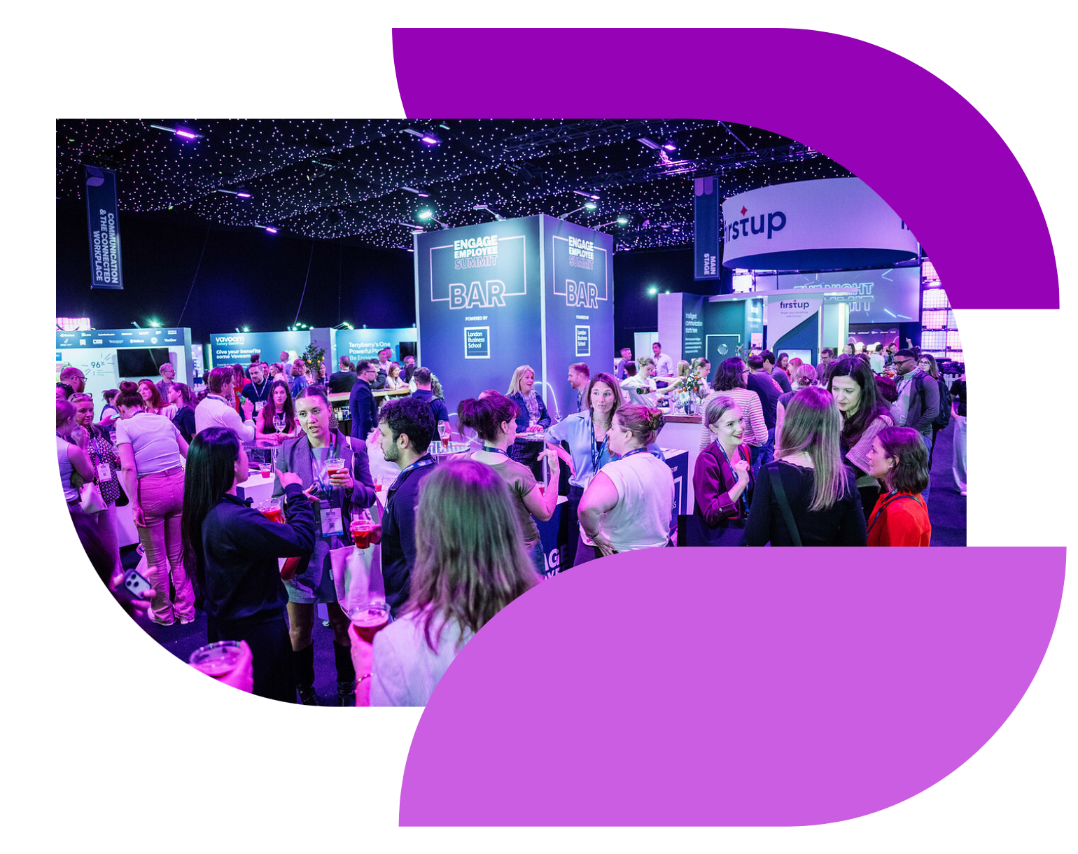
Any image field left empty shows one of these. Add, remove or replace them in the syndicut_ebm_employee_placeholder_images HubDB table, then publish the table.
-
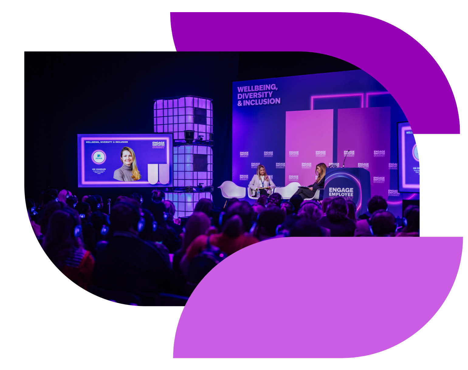 1
-
2
-
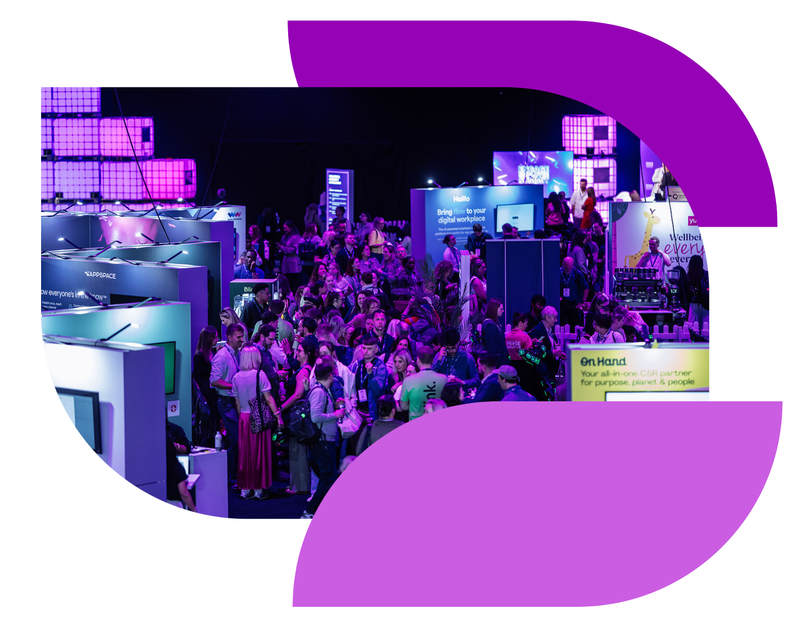 3
-
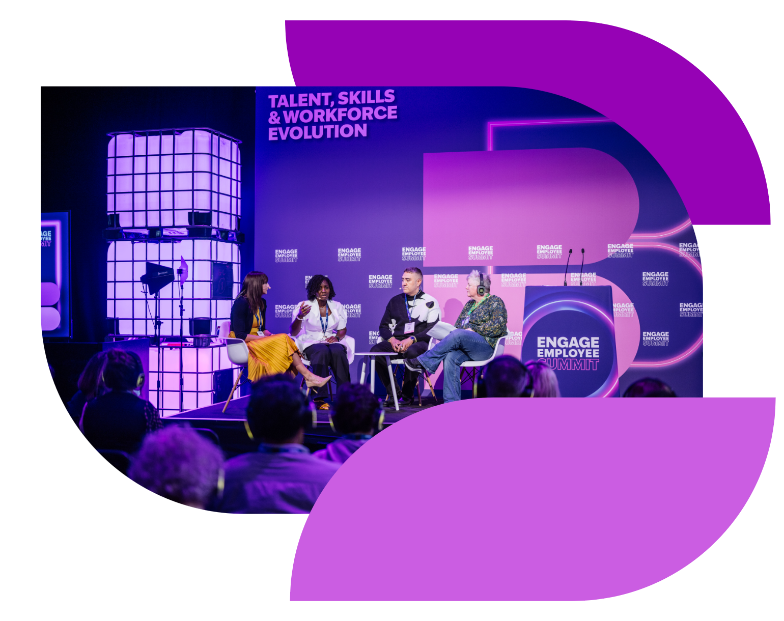 4
-
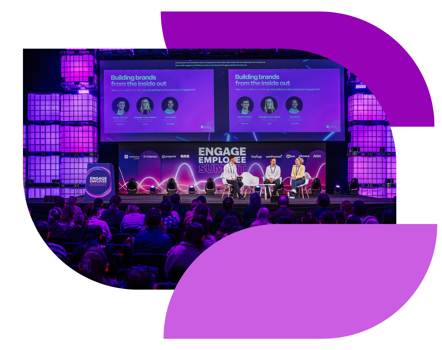 5
-
 6
CMS Content (Rich Text)
H1 Heading
Lorem ipsum dolor sit amet, consectetur adipiscing elit. Quisque hendrerit purus ex, eget molestie quam rutrum vitae. In egestas faucibus magna, vel malesuada mi tempor a.
H2 Heading
Lorem ipsum dolor sit amet, consectetur adipiscing elit. Quisque hendrerit purus ex, eget molestie quam rutrum vitae. In egestas faucibus magna, vel malesuada mi tempor a.
H3 Heading
Lorem ipsum dolor sit amet, consectetur adipiscing elit. Quisque hendrerit purus ex, eget molestie quam rutrum vitae. In egestas faucibus magna, vel malesuada mi tempor a.
H4 Heading
Lorem ipsum dolor sit amet, consectetur adipiscing elit. Quisque hendrerit purus ex, eget molestie quam rutrum vitae. In egestas faucibus magna, vel malesuada mi tempor a.
H5 Heading
Lorem ipsum dolor sit amet, consectetur adipiscing elit. Quisque hendrerit purus ex, eget molestie quam rutrum vitae. In egestas faucibus magna, vel malesuada mi tempor a.
Lorem ipsum dolor sit amet, consectetur adipiscing elit. Quisque hendrerit purus ex, eget molestie quam rutrum vitae. In egestas faucibus magna, vel malesuada mi tempor a.
This is a blockquote. Lorem ipsum dolor sit amet, consectetur adipiscing elit. Quisque hendrerit purus ex, eget molestie quam rutrum vitae. In egestas faucibus magna, vel malesuada mi tempor a.
- This is a list item in an unordered list
-
An unordered list is a list in which the sequence of items is not
important
- This is a list item in an unordered list
- An unordered list is a list in which the sequence of items is not important
- This is a list item in an unordered list
- An unordered list is a list in which the sequence of items is not important
- This is a list item in an ordered list
- An ordered list is a list in where the sequence of items is important
- This is a list item in an unordered list
- An unordered list is a list in which the sequence of items is not important
- This is a list item in an unordered list
- An unordered list is a list in which the sequence of items is not important
- This is a list item in an ordered list
- An unordered list is a list in which the sequence of items is not important
- This is a list item in an ordered list
- An unordered list is a list in which the sequence of items is not important
- This is a list item in an ordered list
- An unordered list is a list in which the sequence of items is not important
- This is a list item in an ordered list
- An unordered list is a list in which the sequence of items is not important
- This is a list item in an ordered list
- An unordered list is a list in which the sequence of items is not important
Bold text
Italic text
This text contains subscript text.
This text contains superscript text.
This is preformatted text
| Column 1 | Column 2 | Column 3 |
| Lorem ipsum dolor sit amet | Lorem ipsum | Lorem ipsum dolor sit |
| Lorem ipsum | Lorem ipsum dolor sit | Lorem ipsum dolor sit amet, consectetur adipiscing elit |
| Lorem ipsum dolor sit amet | Lorem ipsum | Lorem ipsum dolor sit |
